Veriforce runs five products on five design libraries, and 10 designers couldn't keep pace with ~30 PMs. As the system's only designer and engineer, I built Vantage for designers and non-designers alike. Designers get one shared library, and PMs, developers, and their AI tools get our components and patterns built in: the look is locked in code, and written guidelines cover the behavior. About 4 micro-frontends run on it so far, and retiring the old libraries is next.
Role
Sole designer and engineer. Owned tokens, components, guidelines, and rollout.
Team
10 designers giving feedback. ~30 PMs and their dev teams building on it.
Timeline
Oct 2025 to today. Retiring the five legacy libraries is next.
The problem: five libraries, and more builders than designers
Veriforce sells contractor safety and compliance software. Acquisitions turned it into a suite of SaaS applications: Highwire, SafeContractor, Compliance Pro, Verisource, and WorkerPass. These frequent acquisitions had designers spread thin trying to maintain five different design libraries.
- Customers felt the seams. A customer adding a second product got an app that looked and worked nothing like the first.
- Design couldn't keep up. 10 designers served ~30 PMs with no shared components. Design either started from screenshots or utilized very outdated libraries.
- The last shared system didn't stick. An earlier attempt was a Figma file of 10,000+ variables and all-custom components. It was too ambitious for a team our size, and the number of variables made it hard to adopt. Developers wanted something that was actively maintained.
The insight: designers needed one shared system, but most screens wouldn't be built by designers. They'd be built by PMs and developers, more and more through AI tools. Designers couldn't review all of those screens, so I wanted the system to carry as many of design's decisions and patterns as possible.
Most screens wouldn't be built by designers. They'd be built by PMs and developers, more and more through AI.
The bet: a theme on MUI, the library AI already knows
Aligning the old libraries would have kept five things to maintain. Going custom again would repeat the last attempt, and was too much for one person. So I built a theme on MUI. AI tools write React well, and MUI is the most popular React component library, already used in some of our apps. A model already knows it, so it builds with Vantage easily. MUI brings proven, accessible components, so I could spend my time on the parts that make them ours. It's the same call I made at Highwire with PrimeNG: pick a system the team can actually support.
How it fits together: one source, published for every stack
Vantage has three parts: tokens, components, and guidelines. They come from one source and ship together, so designers, developers, and AI tools all work from the same thing.
- 01FigmaSource of truthVariablesPrimitives, theme, and component sizesComponent libraryReferences the variables
- Tokens Studio exports the variables as JSON02Code repoBuildStyle DictionaryCSS · SCSS · JS/TSMUI themeMUI 7 · MUI 9Custom componentsReactGuidelinesMarkdown
- 03npmPublishTokens packageTokens, themes, and guidelinesComponents packageCustom components
- 04Used byPeople and AIAngular appsCSS and SCSS tokensReact appsTheme and componentsFigma MakeBoth packages and the guidelinesClaude DesignSynced from the repo by a GitHub workflowAI coding assistantsThe guidelines
Figma variables are the source. Everything after them is built and published from one repo.
I set it up this way so a token only has to change in one place. Designers work in Figma, so I made Figma variables the source of truth. That way designers can reference the same tokens developers use. From there, the build turns them into whatever each app needs, since our apps run on different stacks and MUI versions.
Publishing everything from one repo means apps, Figma Make, Claude Design, and AI coding assistants all pick up the same updates.
Once PMs and designers started building in Figma Make and Claude Design, we noticed AI would fill in gaps with its own choices, and it was producing screens faster than design could review them. So I split the system by what each part can enforce:
- The look lives in the theme. Color, type, spacing, and component styling are set in code, so a model gets them right by default.
- The guidelines cover behavior: how we handle errors, how tables work, and how components combine.
Anything that can be decided in code is locked in code. Words cover what code can't decide.
1. Tokens: small enough for one person to keep
The last shared system had 10,000+ variables, which made it hard for teams to adopt. By relying on a semantic layer of tokens and switching dark mode at the primitive layer, I got that down to about 1,200.
| Layer | What it holds | Example |
|---|---|---|
| Primitives | Raw color scales, ten steps each | blue/600 |
| Theme | What a color is for: surfaces, text, borders, states | error/border |
| Component | Only sizes: border widths and radii | button/border-radius |
Component tokens only hold sizes, like border widths and radii. Component colors come from the theme layer, where each state, like error or success, gets the same set of slots. Teams pick from colors that already exist.
Brands only override two things: primary color and logo. For now, that means a brand can't restyle a single component. I was fine with that, since consistency across products was the goal.
Light and dark mode live at the primitive layer. That gave me room for exceptions: when a color needs to behave differently, like a primary button that should look the same in both modes, its semantic token just points at a different primitive. Otherwise the semantic layer would fill up with one-off tokens for each mode.
I tuned every color in both modes with contrast checkers in Figma and Lighthouse. I adjusted values until each scale had even steps, and checked the text and background pairs we use against WCAG AA.
Drag to compare. Only the primitives change between modes.
The dark scales also aren't a straight inversion of the light ones. Flipped as-is, the darkest steps were too saturated for dark backgrounds and the lightest steps were too bright, so I muted the dark end and toned down the light end.
Each dark scale is tuned for dark backgrounds, with softer ends than a straight flip would give.
2. Components: only the options we use
I found MUI was too flexible for us and offered more options than we needed. As a small team, I needed to keep the system narrow and focused, so I removed any unnecessary variants, like extra Checkbox and Radio sizes, extra TextField styles, and filled Alerts. I based most of these cuts on design systems from larger companies. My reasoning was that if very large companies can make it work with less variance, we could too. That keeps screens consistent, and cut down on maintenance.
Teams do lose some flexibility. If a team needs a variant I removed, we talk it through and decide whether to bring it back.
Custom components, where MUI stopped
MUI components didn't get us all the way there, so I maintain a thin layer of custom components on top of it. These came out of designing in Figma. They were the first gaps we noticed, where we wanted more control over the UX. Most of them, like the Sidebar and PageHeader, are mainly layout, so every app gets the same structure.
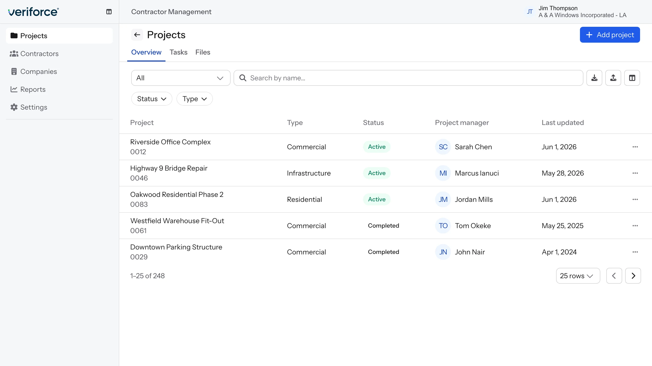
A table page built from the custom components. Every color on it is a theme token, so it switches modes with no dark values of its own.
FilterChip is different, because the behavior is the point. Every app filters tables, and without a shared component each team would build filtering its own way. FilterChip is one component with eight variants, from a yes/no toggle to number ranges. The select variants are built on MUI's Autocomplete and styled as a chip: you click to open it, type to narrow the list, and press Enter to pick. Multi-select stays open so you can pick several, and the chip resizes to show what's selected, with an X to clear it.
Writing all of that as guidelines would take pages, and teams would still build it a little differently. Putting it in the component means every app gets the same behavior.
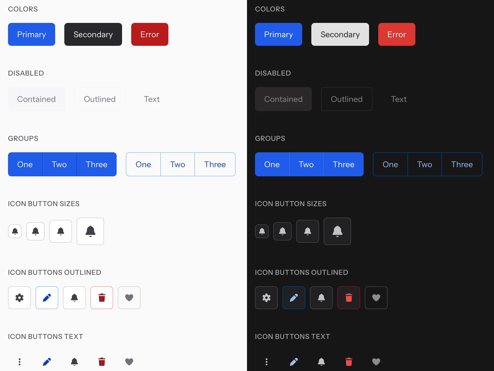
Primary holds across modes. Error brightens and Secondary inverts. Every label's color comes from a token.
3. Guidelines: the judgment calls code can't make
Tokens and components only go so far. How a screen turns out still depends on how someone uses them, and that's the gap the guidelines fill. They put the reasoning behind our decisions in one place, written so designers and AI tools can both read it.
The guidelines are 28 Markdown files, mostly in three groups:
- Components: when to use each one, with do's and don'ts. For example, use Radio for two or three options and Autocomplete for 15 or more.
- Patterns: how components work together for common tasks, like adding, editing, and filtering table data, or validating a form.
- Conventions: general rules that apply everywhere, like button hierarchy, required fields, and where focus goes.
When AI gets something wrong, I add a rule, so the guidelines keep growing with how people actually build. They're also published on the docs site, so designers read the same rules the AI does.
Example: editing a record. The Edit table data pattern says quick edits open in a drawer, so the table stays visible while you edit, and bigger edits get their own page. Having two ways to edit means people need to know which one to use, so the pattern spells it out: a handful of simple fields is a quick edit.
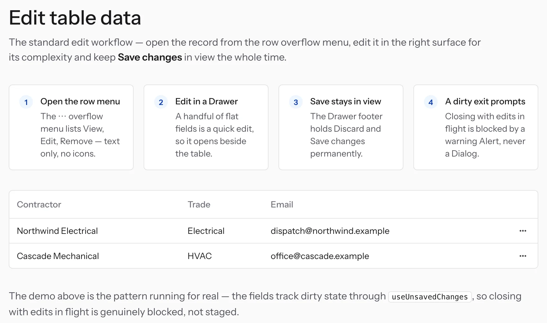
Each pattern pairs steps with a working demo, so people and AI get the decision along with the component.
Putting it together
Here's what tokens, components, and guidelines look like working together. The screen uses our tokens and components, and the layout follows our patterns.
The prompt doesn't mention a drawer. The agent chose one based on the guideline and explained why.
Rolling it out: no mandate, and nothing retired yet
The goal is five libraries down to one. None is retired yet. That's the next phase, working with each product group.
The blocker is foundations. Several apps run old versions of Node and React, so they need to upgrade before they can take the full system. At each step, we weigh whether it's worth it for that app.
Each branch weighs the cost of moving. Apps that are being replaced skip it, and apps outside React adopt the tokens only.
We also follow two rules: don't hold up features sales needs, and don't migrate an app that's about to be replaced.
Legacy screens are the hardest call. If we design them in Vantage, developers can't build them 1:1 yet, but designing them in the old system doesn't move us forward. For now, new work goes first, and legacy screens follow where it makes sense.
PMs and designers both prototype in Figma Make on Vantage. It doesn't replace design review, and requirements are still an open problem. It does give us a better starting point, since a first draft already uses our components and patterns before a designer sees it.
It also helps set the vision. Day to day, it's easy for designers and PMs to stick with what we have, because it works. Prototyping on Vantage shows what our apps could look like and how they should behave, which gives teams something concrete to move toward as we migrate.
Feedback, and what I missed
I set up a feedback channel in Microsoft Teams so I could work with product teams directly and keep conversations in a public space, where everyone can see the questions and answers.
The biggest thing I missed was other languages. I built the components for English, and as regional teams picked them up, the first thing they asked for was translation. I added locale support, with eight languages so far, from French Canadian to German. Next time, I'd build it in from the start.
Where adoption stands
| Where | Status |
|---|---|
| Micro-frontends | About 4 on Vantage |
| Design tokens | 1.17K package downloads |
| Components | Just shipped, no numbers yet |
| Guidelines | 28 files, about 274 rules, ~49 components synced to Claude Design |
| Legacy libraries | 0 of 5 retired. Next phase. |
Takeaways
- Put the look in code, and use guidelines for behavior. AI tools follow defaults more reliably than written instructions, so I put as much as I could into the theme.
- Remove the options you don't need. Fewer variants meant fewer inconsistencies, whether a person or AI was building.
- Plan for other languages early. Adding translation to shipped components took more work than building it in would have.
- Design for whoever is building the screen. Here that's often PMs using AI tools, so the system needs to carry design's decisions when a designer isn't involved.